| Year | 2017 — 2018 |
| Name | AKACORLEONE |
| Client | AKACORLEONE |
| Category | Visual Identity; Web Design; |
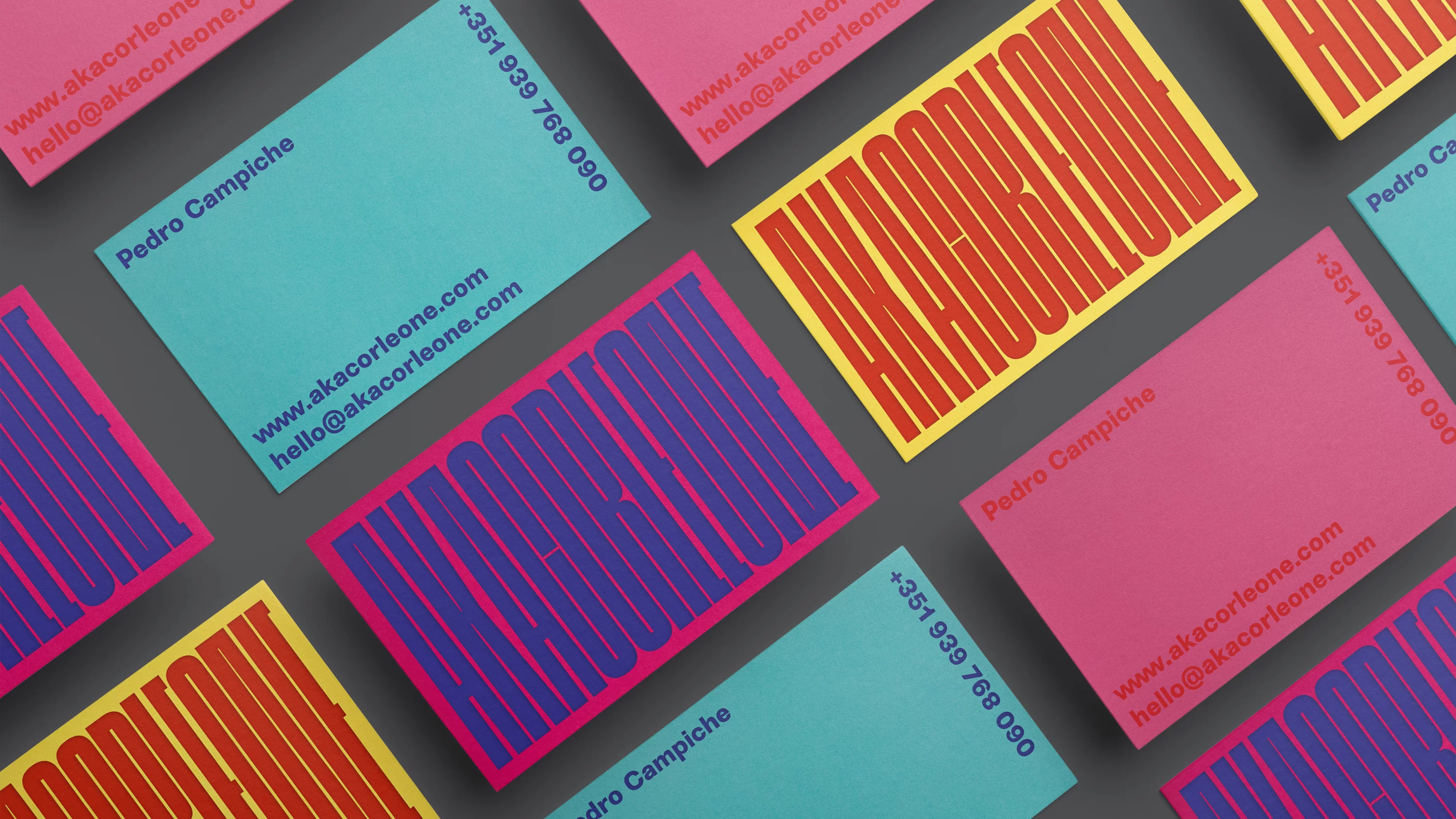
For the design of AKA Corleone’s brand identity, we developed a responsive system that is recognized mainly through its use of colours and, more importantly, how typography behaves. It’s loud, occupying every inch of space available to ensure that while it does not clash, it mimics the artist’s voice. This approach allows the typography to speak boldly and dynamically as the artist himself, making a pronounced visual impact wherever it appears.
This design strategy is not just about making a statement — it’s about creating a connection. By allowing the typography to fill the space assertively, we invite viewers to engage directly with the artist’s energetic presence. This method doesn’t just represent the artist visually; it echoes his style and personality, creating a lasting impression that resonates with audiences, ensuring the artist’s voice is heard and felt.


