| Year | 2023 |
| Name | b.leza |
| Client | Clube b.leza |
| Category | Visual Identity; Communication; |
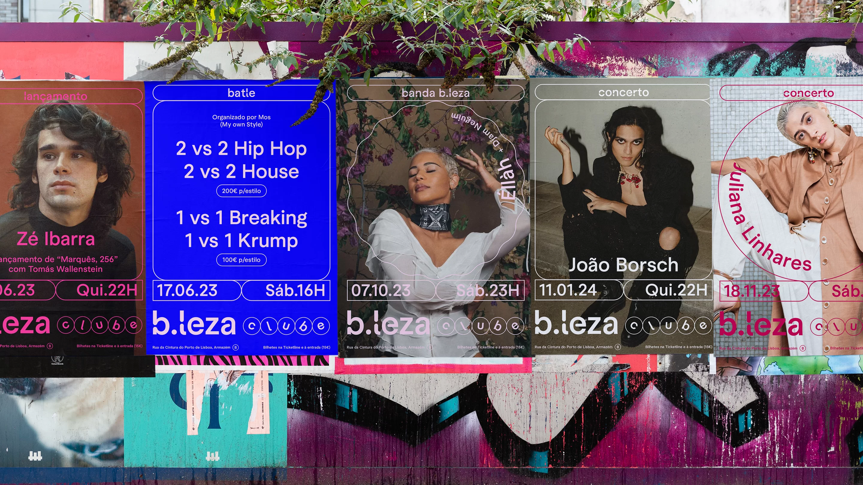
We developed a brand identity for b.leza, a renowned music venue and dance club in Lisbon, that evolved from the club’s signature feature – the “.” in “b.leza.” This single dot became the genesis of a geometric landscape, defining the visual world of b.leza in a new way.
Our approach was to create a system where geometric shapes act as containers, encapsulating the vibrant energy and rhythm of b.leza. These shapes form a versatile and dynamic grid, adaptable to various applications, from digital media to print.
The identity retains the iconic fluor pink colour of the venue, albeit with a subtle tweak. This continuity in colour ensures that the soul of b.leza – lively, energetic, and distinctly urban – remains intact while the refreshed design adds a contemporary edge.
Our design aims to carefully balance tradition with innovation, reflecting b.leza’s legacy as a staple in Lisbon’s music scene yet positioning it firmly in the present.


