| Year | 2026 |
| Name | Rialto6 – Exposição “itede, itepe” |
| Client | Rialto6 |
| Category | Visual Identity; Art Direction; Communication; |
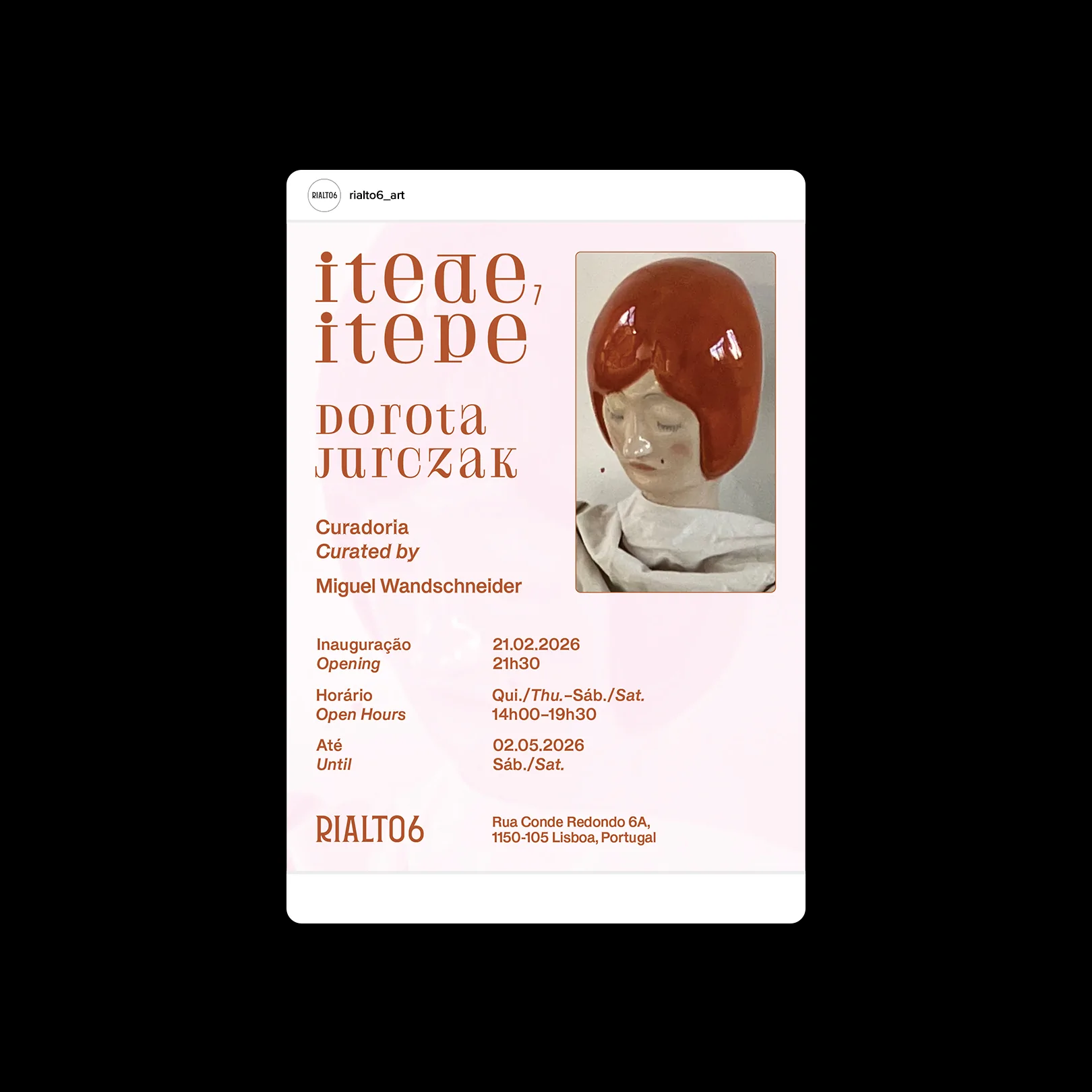
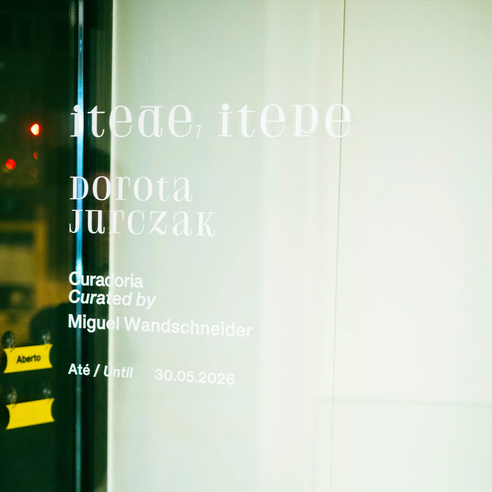
The title was already a typographic problem before we arrived. itede, itepe is a phonetic approximation of how the Polish abbreviations itd. and itp. are read aloud, “etcetera”, “and so on”, “and things of that kind”. Spoken language imitating written language.
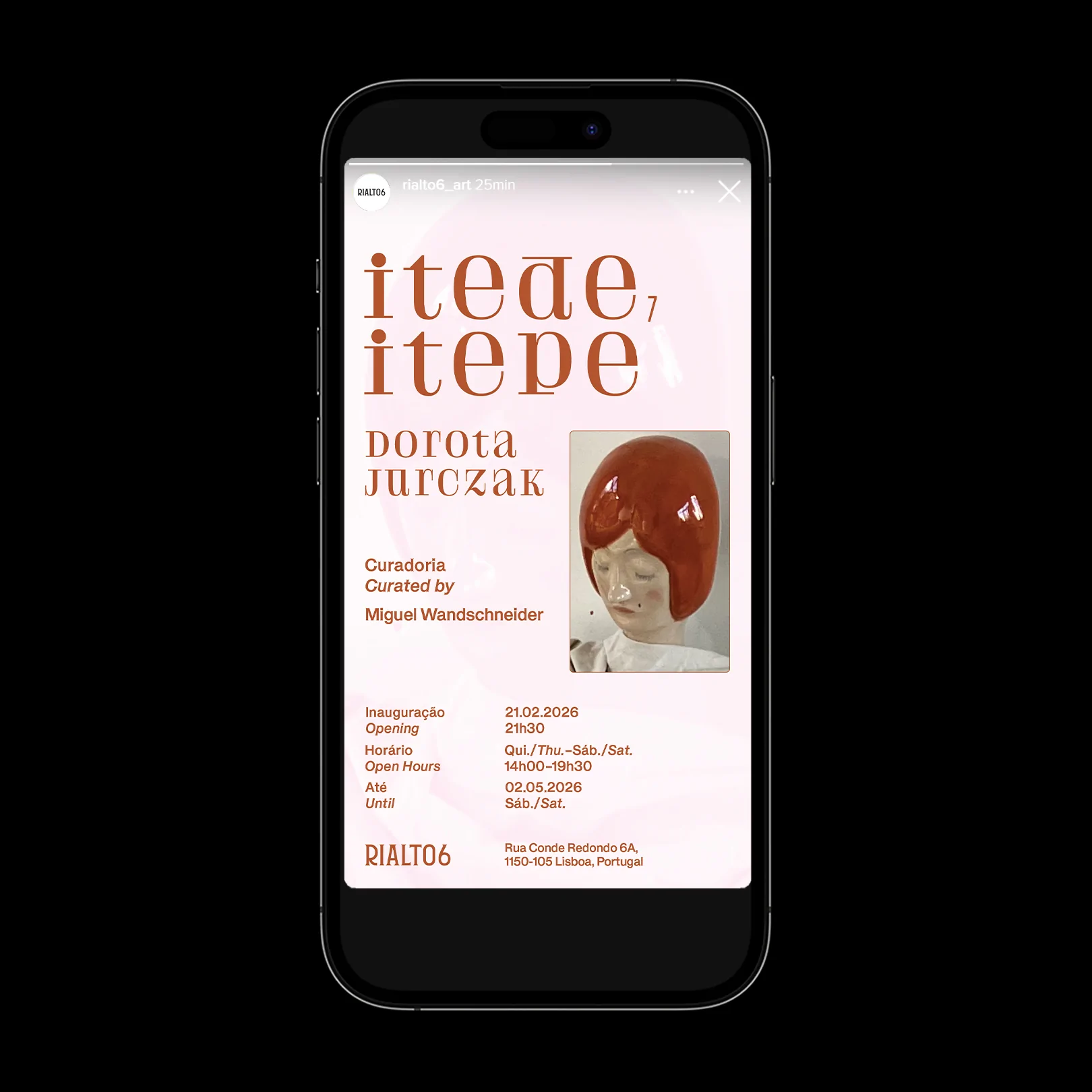
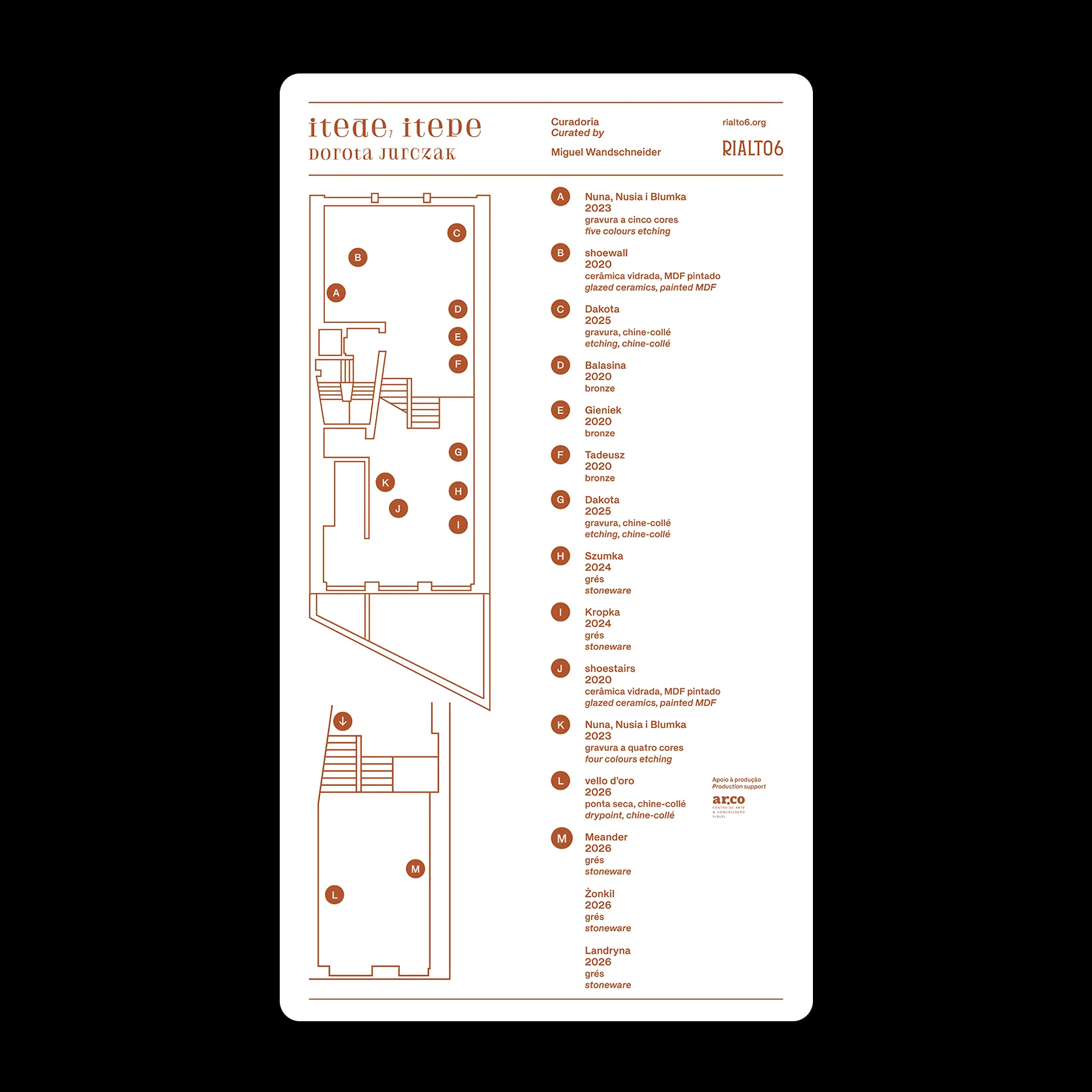
An exhibition whose title is sound turned into lettering was, from the outset, a risk. We chose a typeface with character, with a pronounced, almost figurative design, because Jurczak’s work lives in that same ambiguity: an abundance of colour and pattern pushed towards the uncanny.
The pastel colours play the same game from the opposite side. The sweetness of the palette disarms; the drawing of the letters unsettles. The graphic system repeats the tension of the works rather than explaining it.