| Year | 2026 |
| Name | Rialto6 |
| Client | Rialto6 |
| Category | Visual Identity; Web Design; Art Direction; |
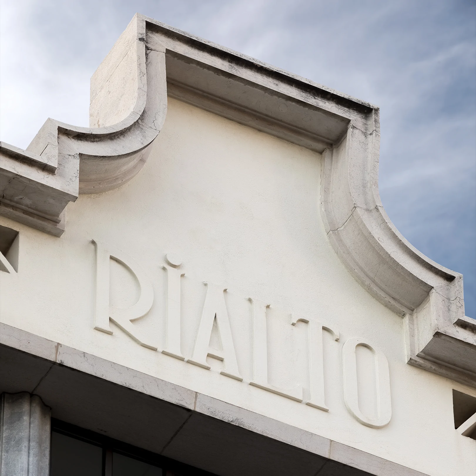
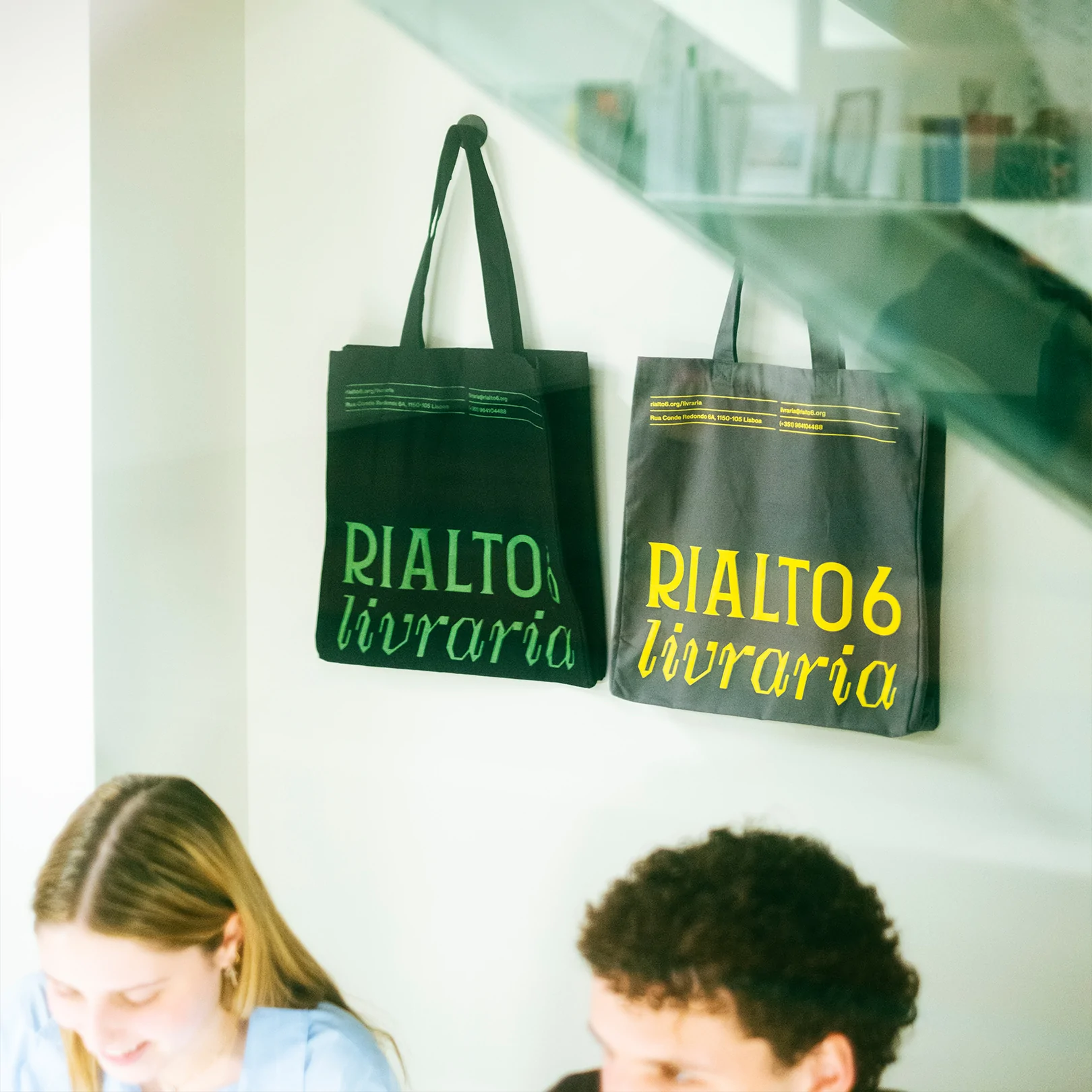
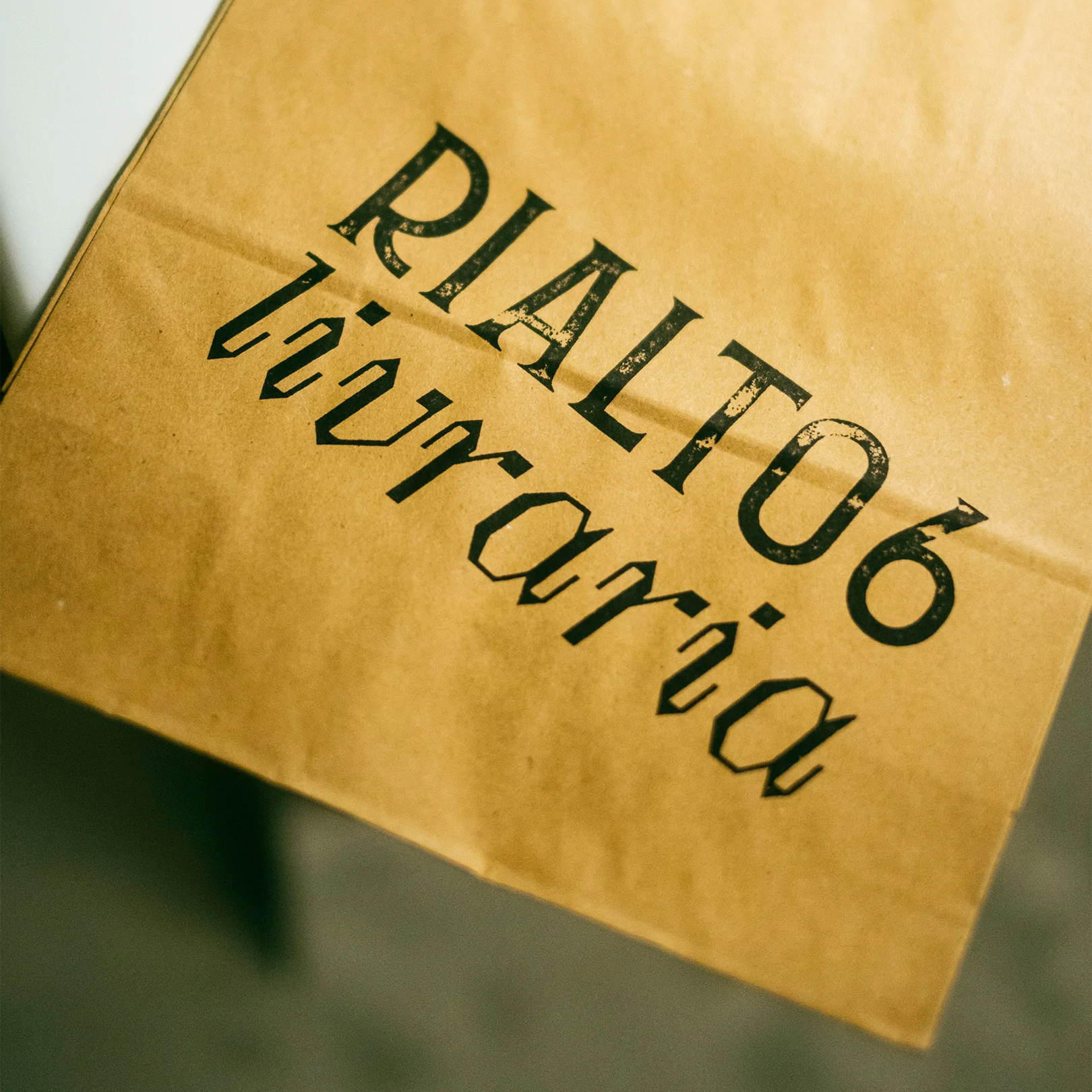
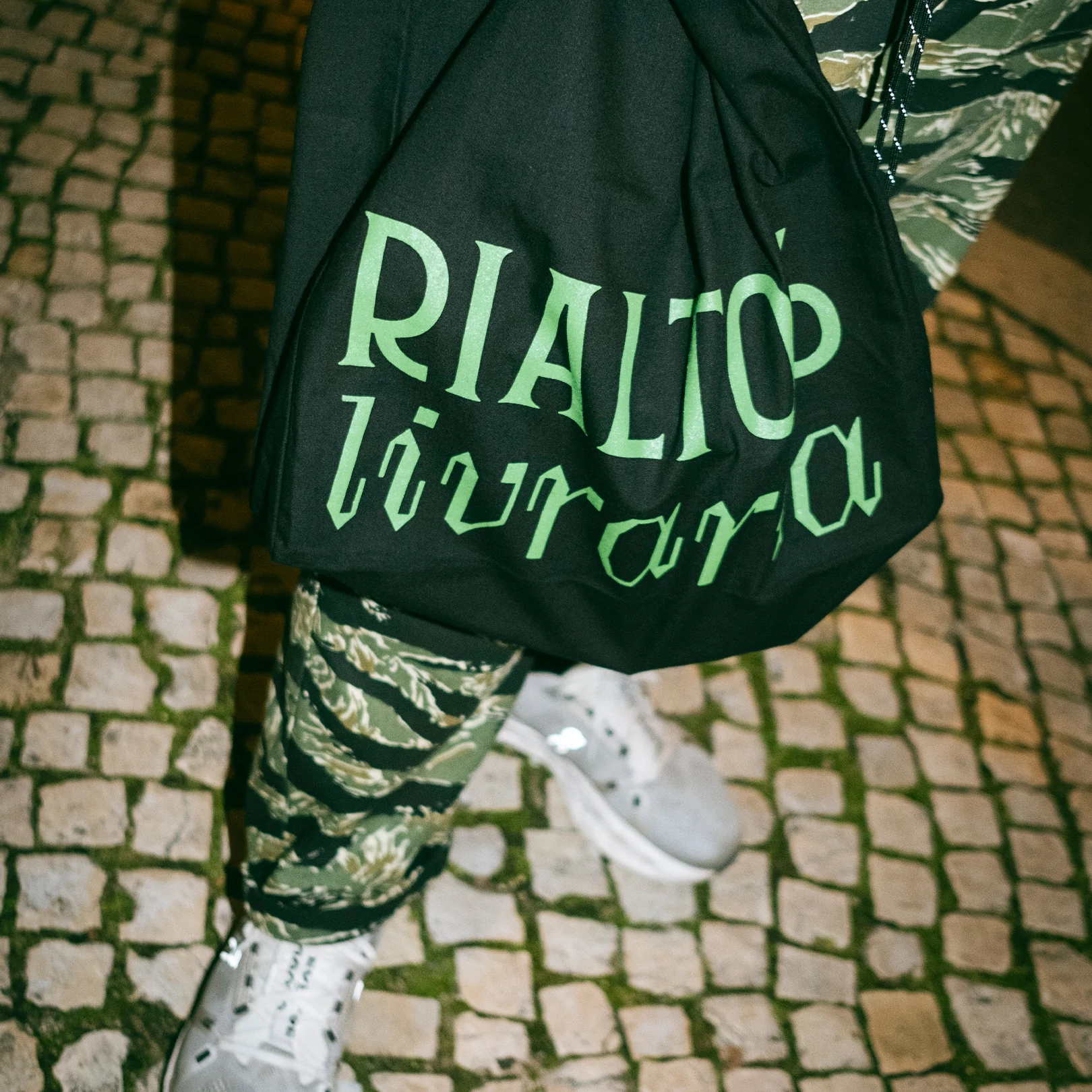
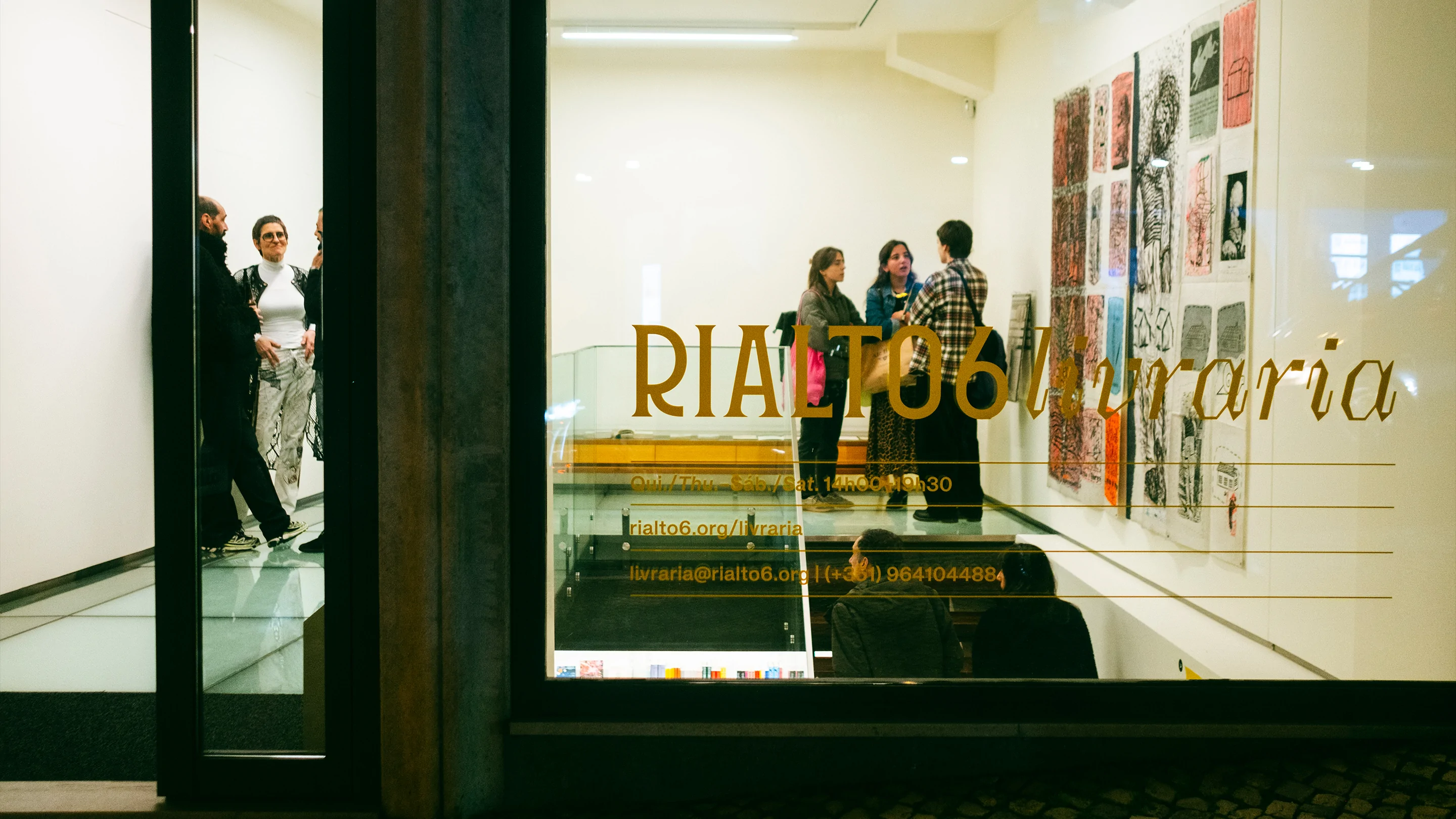
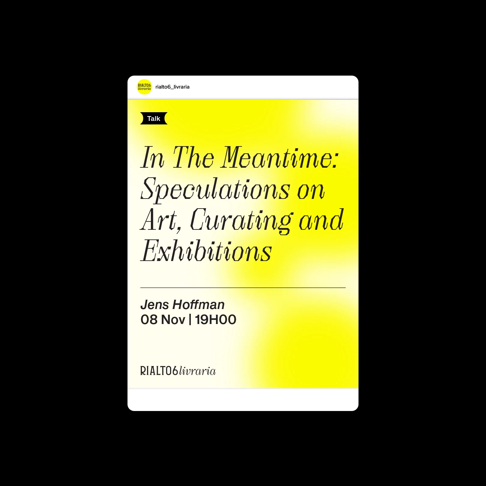
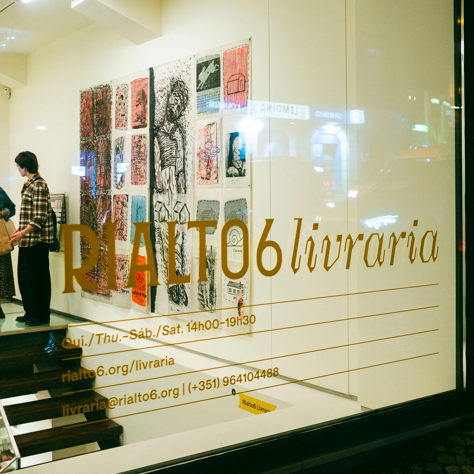
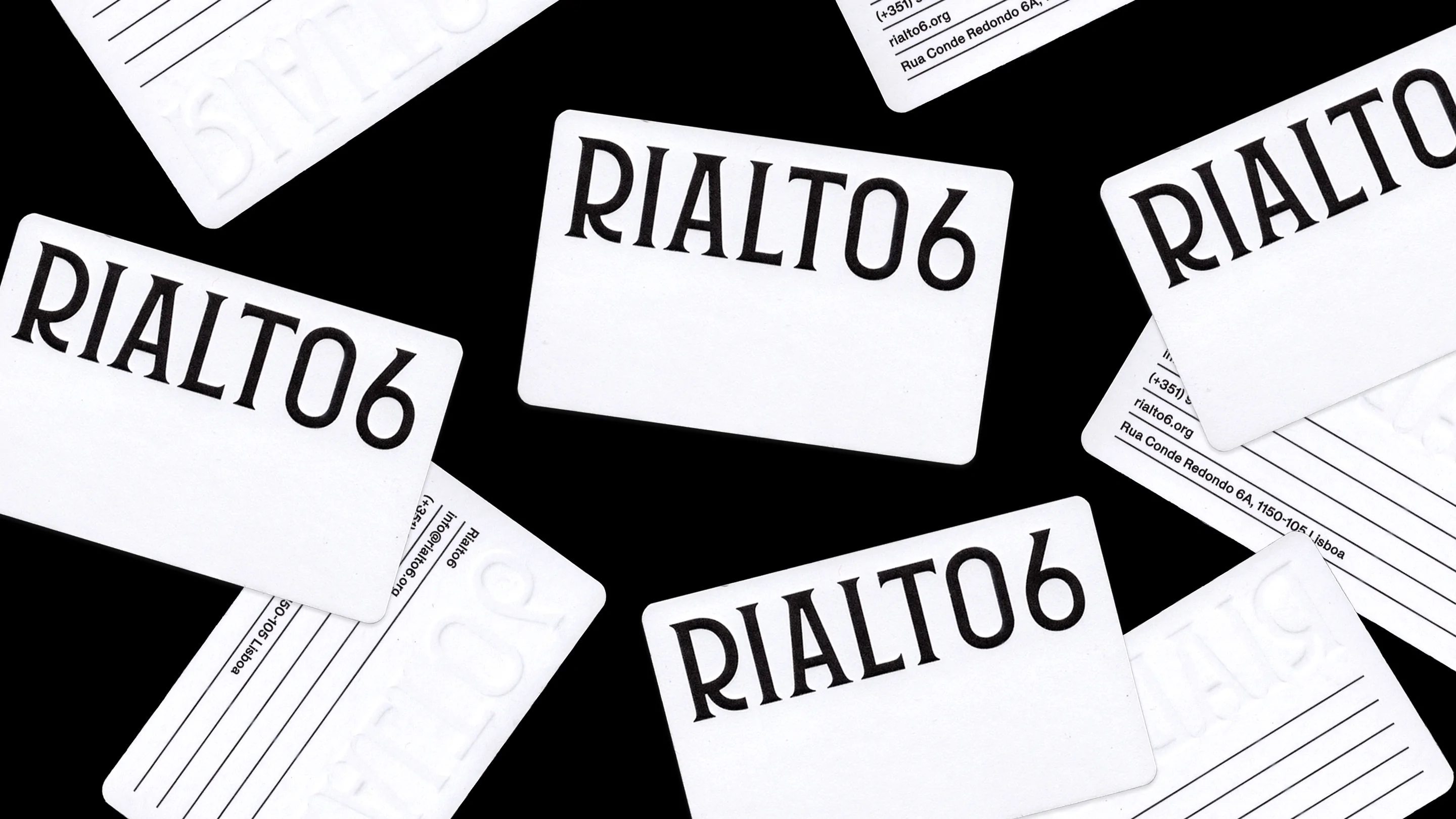
The identity and graphic system for Rialto6 were developed from the building’s façade. We did not want it to function merely as a reference; we wanted it to be the starting point. The letterforms already there, carved into the stone, became the point of departure. The project was to emerge from the place itself before becoming a drawing.
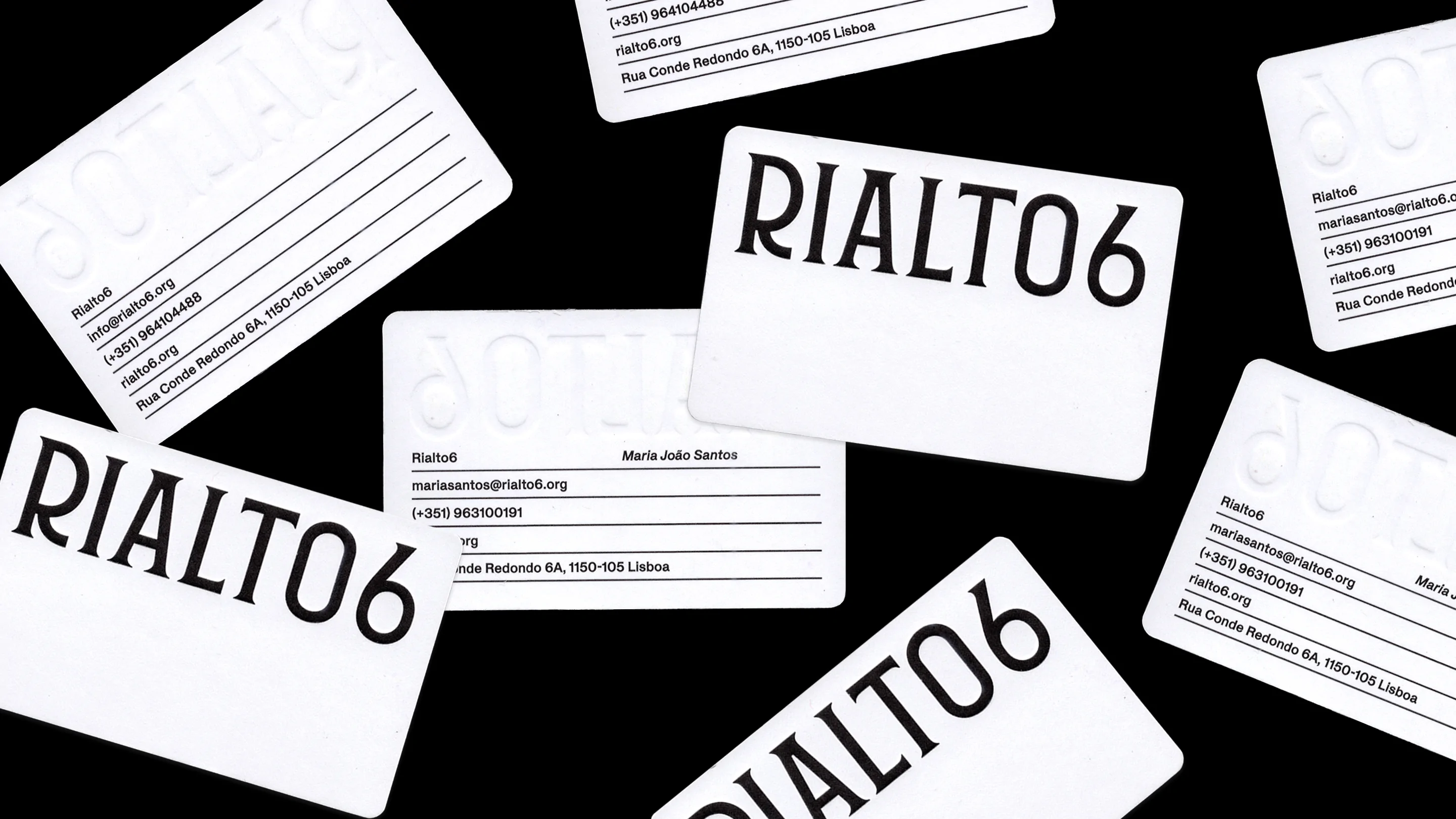
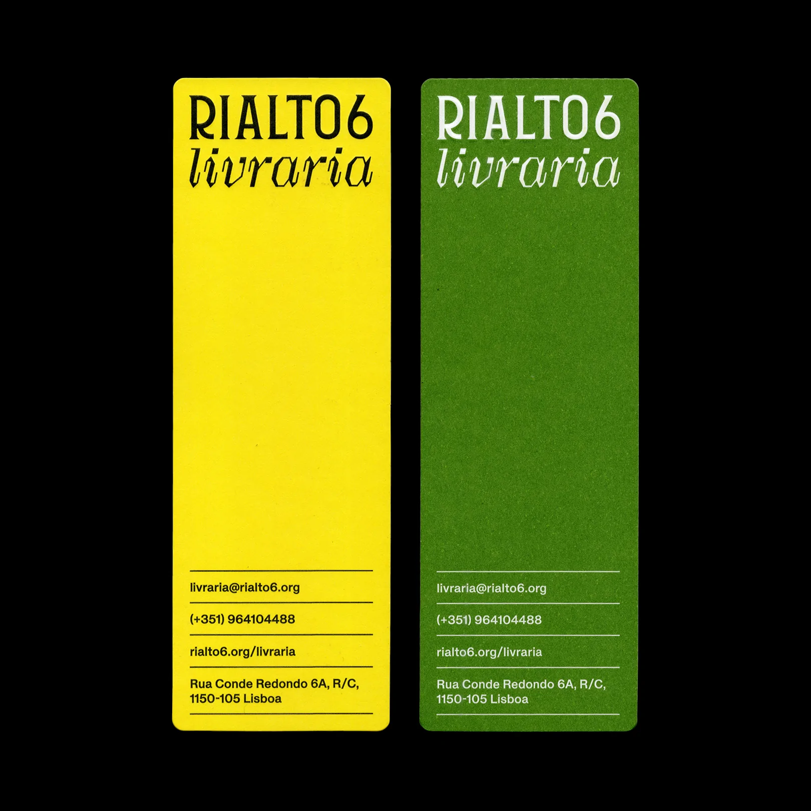
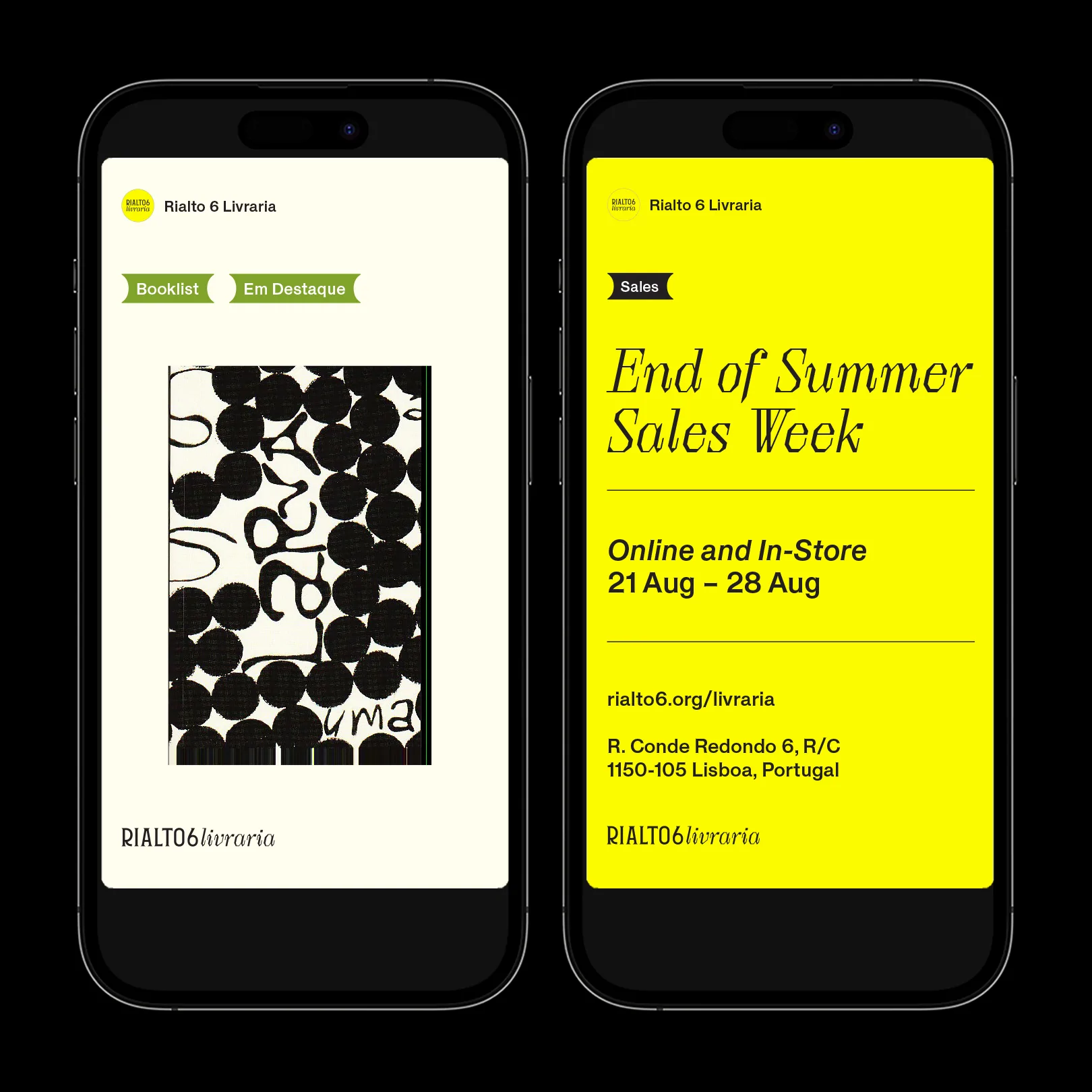
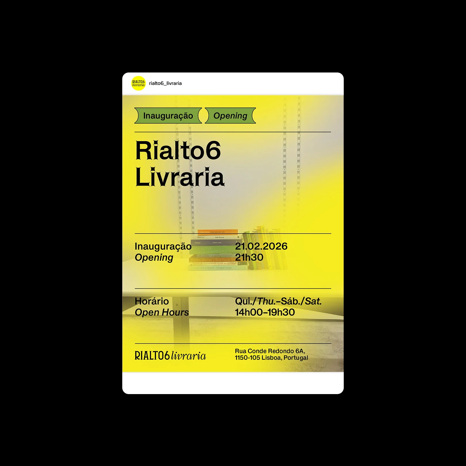
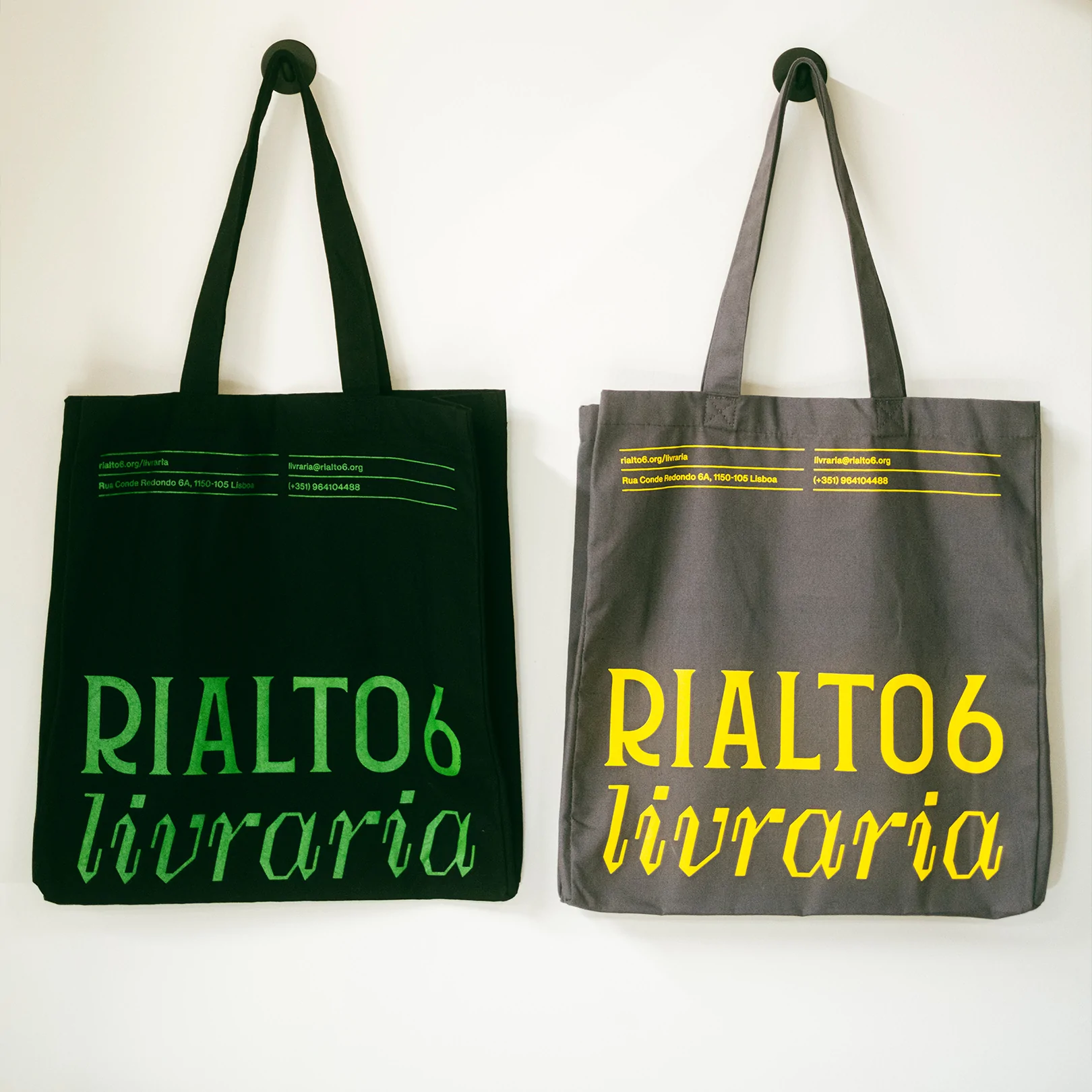
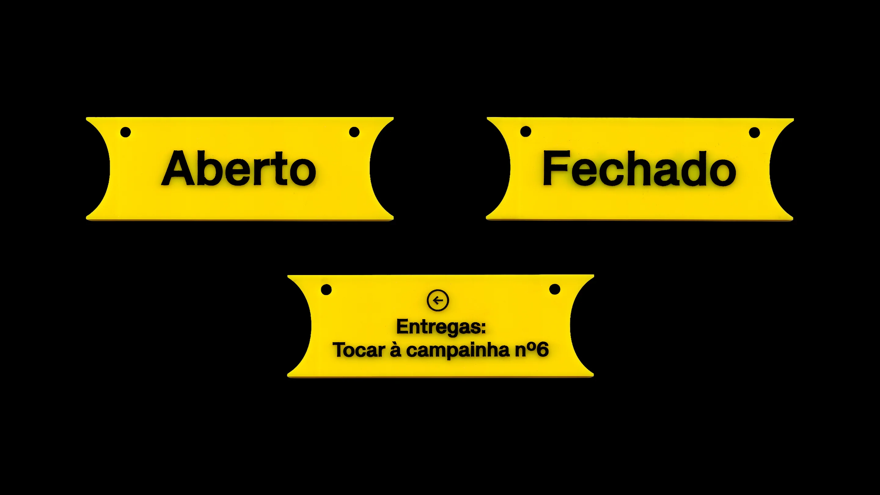
From there came the search for an expanded gesture: something that could grow from the façade to the screen without losing its origin. The choice of colours and the introduction of lines followed this same logic: simple elements, able to provide structure without closing things down.
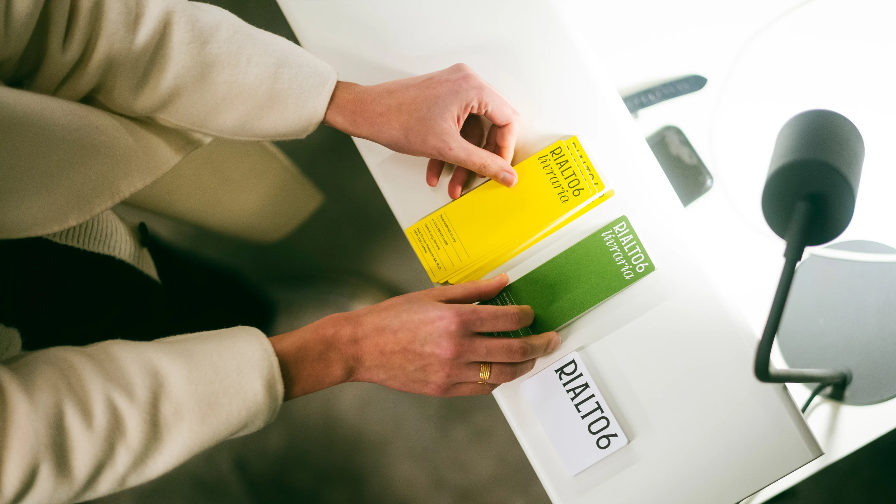
The project is both gallery and bookshop, and the shift was necessary precisely because of this new beginning, which we chose to mark with a bold typographic gesture. A deliberate counterpoint, distinguishing the two spaces without separating them.